Carousel is one of my favorite modules in Jetpack. It allows you to create amazing interactive galleries in no time. And it works great in combination with Tiled Galleries—another cool tool that can make your galleries look professional.
I use them both to display portfolio galleries in Maker. But there is a tiny thing that kind of sours the overall user experience a bit.
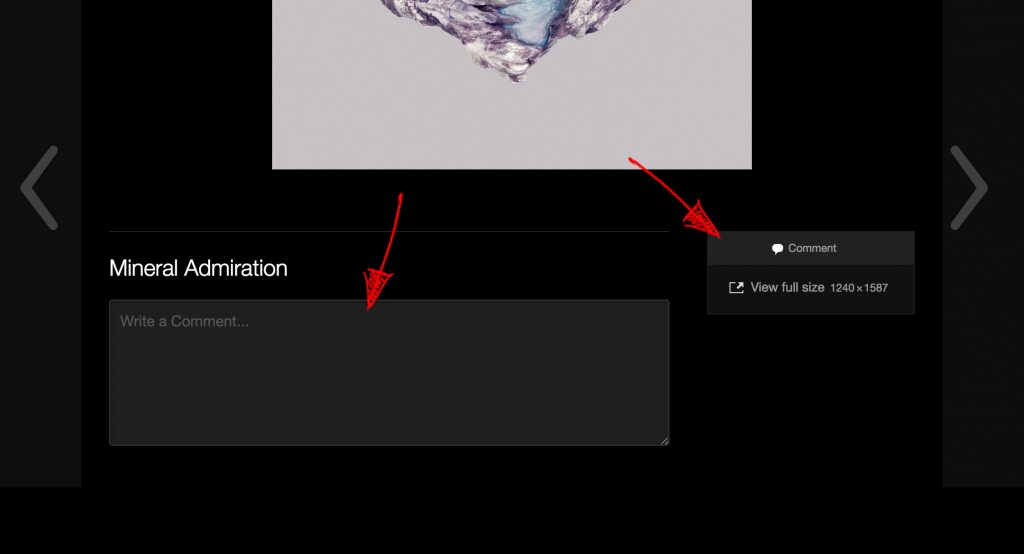
By default, when you click on an image, you see a comment form and a small box with the metadata and a link to a full-sized image. Not something that every gallery requires.
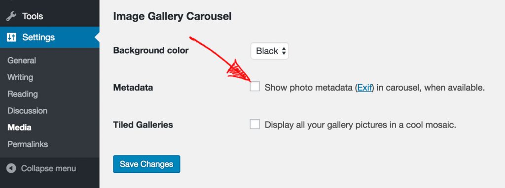
You can disable the metadata by going to Settings → Media and unchecking the Metadata checkbox:
Removing the Comment Form
Disabling comments is a somewhat trickier because it requires a bit of coding. There is a filter called comments_open that you can use to disable comments on all attachment pages. This short snippet will do just that:
function jce_remove_attachment_comments( $open, $post_id ) {
  $post = get_post( $post_id );
    if ( 'attachment' == $post->post_type ) {
      return false;
    }
    return $open;
  }
add_filter( 'comments_open', 'jce_remove_attachment_comments', 10 , 2 );
But even if you filter out all comments, you’re still left with the title of the image and a link to a full-sized image hanging in the right part of the screen.
CSS Tweaks
To fix this, add the CSS snippet below to your website, using JetPack’s Custom CSS module.
/* Center the caption. */
.jp-carousel-info h2 {
 text-align: center !important;
}

/* Hide comment form header. */
.jp-carousel-left-column-wrapper {
 display: none !important;
}

/* Center the metabox. */
.jp-carousel-image-meta {
 float: none !important;
 margin-left: auto;
 margin-right: auto;
}
Moving the Close Icon
Another small thing that bugs me is the close hint icon that is displayed in the top-left part of the screen by default, which is a bit confusing for many users.
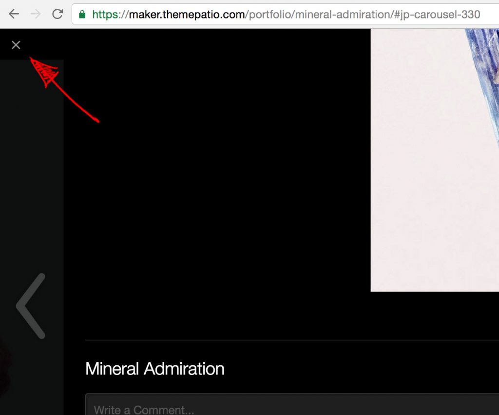
In case you want to move it to the right, use this snippet:
/* Move close icon to the right. */
.jp-carousel-transitions .jp-carousel-close-hint {
  position: fixed;
  text-align: right;
  right: 12px;
  width: auto;
}
Wrap Up
With all the code above, the Carousel screen will look something like this:
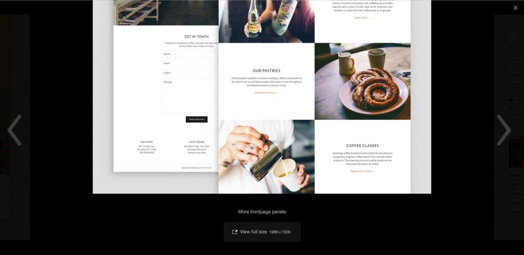
Much cleaner and more image-centric (if this is the right word).
Don’t want to get your hands dirty writing PHP and CSS snippets? Download these modifications in a form of a plugin from GitHub.
If you like this post, follow me on Twitter or leave a comment below if you have any questions.
Thanks you for the hints! I have taken them one step further here: http://mag.mettaloop.com/tech/website-hosting/wordpress/prettifying-the-jetpack-carousel/
Cool, thanks for sharing!
Hi, where exactly do I need to insert the snippet for the filter comments_open?
Thank you, Phil
Thank you! Helped a lot. I was breaking my head about this.
Awesome thank you!
Thanks, you saved my life. 🙂
Why carousel comment section is not disable natively in Jetpack settings is a mistery.